Webbo3 Data Analysis Bootcamp · Excel Module · Capstone Project
Excel Capstone Project: End-to-End Business Data Analysis from Raw Data to Polished Dashboard
A complete independent project that brings together every skill from this bootcamp: data cleaning, functions, Pivot Tables, charts, dashboard design, and sheet protection. You will work with a real business dataset, build a full analysis, and submit it for instructor review.
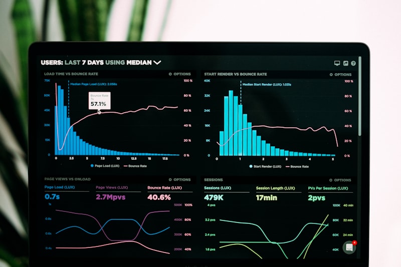
This is the final project of the Excel module. Everything you have learned so far, data types and entry, formatting, basic and advanced formulas, Pivot Tables, charts, dashboard design, and sheet protection, comes together here. The capstone is not a test of memory. It is a test of workflow. Can you take a messy, real-world dataset, clean it, analyze it, visualize it, and present it in a way that a business decision-maker can understand in thirty seconds? That is the skill employers pay for. This lesson gives you the project brief, the dataset, the deliverables, and the grading criteria. Your job is to execute.
1. The Project Brief
You are a data analyst at a fictional retail company called NovaMart, which operates twelve stores across six regions in Nigeria. The company sells electronics, clothing, home goods, and groceries. Your manager has emailed you a raw sales dataset exported from the company's point-of-sale system and asked you to answer three specific questions before the quarterly review meeting.
Question one: Which product category is driving the most revenue, and which is dragging profit margins down?
Question two: How are sales trending month by month, and which region is outperforming or underperforming compared to the company average?
Question three: If the company wants to close its worst-performing store, which one should it be, and what is the financial impact?
Your deliverable is a single Excel workbook with three sheets: a Data sheet containing your cleaned dataset, an Analysis sheet with your Pivot Tables and summary calculations, and a Dashboard sheet that answers all three questions visually and interactively. The dashboard must be protected, with only designated input cells unlocked. The workbook must be suitable for presentation to senior management.

2. The Dataset
The dataset contains the following columns. You will receive it as a CSV file with approximately 2,500 rows. It is intentionally messy, because real data always is.
Transaction_ID: A unique identifier for each sale. Some rows have missing values. Some have duplicates.
Date: The date of the transaction. Stored in mixed formats: some as 14/03/2025, some as 2025-03-14, some as text like "March 14, 2025." Some dates are in the future or before the company was founded.
Store: The store name. Some are spelled inconsistently: "Ikeja Store," "ikeja," "IKEJA BRANCH." Some store names do not exist in the company's directory.
Region: The region the store belongs to: North, South, East, West, Central, or Lagos. Some rows have blank regions. Some have typos like "Lagos State" or "South-West."
Product_Category: Electronics, Clothing, Home Goods, or Groceries. Some rows have abbreviations like "Elec" or "Home." Some have completely wrong categories like "Services."
Product_Name: The specific item sold. This column has inconsistent spacing, mixed cases, and some blank entries.
Quantity: Number of units sold. Some are negative numbers, representing returns. Some are zero. Some are stored as text.
Unit_Price: Price per unit in naira. Some have currency symbols attached. Some use commas as decimal separators. Some are blank.
Discount: Discount percentage applied. Stored variously as 0.10, 10%, 10, or blank. Some discounts exceed 100 percent.
Payment_Method: Cash, Card, Transfer, or Mobile Money. Some rows have misspellings like "Csh" or "Mobil."
Your first task is to clean this dataset. Remove duplicates. Standardize text entries. Fix dates. Convert numbers stored as text. Handle missing values with a documented strategy, for example removing rows with critical missing data or imputing reasonable defaults where appropriate. Create a new column called Revenue calculated as Quantity multiplied by Unit Price. Create a column called Net_Revenue calculated as Revenue minus the discount amount. Create a column called Month extracted from the date. Document every cleaning decision you make, because your instructor will ask why you chose that approach.
3. Required Analysis and Deliverables
After cleaning, you must produce the following analytical outputs on your Analysis sheet.
Pivot Table one: Revenue by Category and Region. Show total revenue and average net revenue per transaction for each product category, broken down by region. This answers question one.
Pivot Table two: Monthly Sales Trend. Show total revenue and total quantity sold by month. Add a calculated field for month-over-month growth percentage. This answers the trend portion of question two.
Pivot Table three: Store Performance Ranking. Rank all twelve stores by total net revenue, total transactions, and average transaction value. Identify the bottom performer. This answers question three.
Summary calculations using functions. Use SUMIFS, AVERAGEIFS, and COUNTIFS to create a summary table that shows key metrics filtered by region and category. Use IF statements to flag stores performing below the company average. Use conditional formatting to highlight the top three and bottom three stores automatically.
Charts for the dashboard. Create at least four charts: a column chart showing revenue by category, a line chart showing the monthly trend, a bar chart ranking stores by net revenue, and a pie or doughnut chart showing payment method distribution. Each chart must have a clear title, labeled axes, and a data table or data labels where appropriate. No default Excel colors. Choose a professional three-color palette.
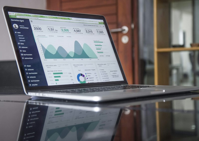
4. Dashboard Requirements
The Dashboard sheet is your final presentation layer. It must meet every standard taught in the dashboard design lesson.
Layout and visual design. Use an inverted pyramid layout. Place three KPI cards at the top showing Total Revenue, Total Transactions, and Average Transaction Value. Use rounded rectangle shapes as card backgrounds. Use text boxes for titles, not cell text. Use one icon per KPI card from Excel's icon library. Align everything precisely using the Align tools. Use no more than three colors. Hide gridlines and row/column headers. The sheet should look like an application, not a spreadsheet.
Linked charts. All four charts must be cut from the Analysis sheet and pasted onto the Dashboard. They must remain linked to their data sources so that if the raw data changes, the dashboard updates. Arrange them using the rule of thirds. Leave white space between elements.
Interactivity with form controls. Add at least one Combo Box form control that lets the user filter the dashboard by region. Add at least one Checkbox that toggles between showing gross revenue and net revenue on the trend chart. The form controls must be linked to formulas on the Analysis sheet that drive dynamic chart updates. The user should be able to change the view without touching any formula directly.
Camera tool snapshot. Use the Camera tool to create at least one live linked picture of a formatted summary table from the Analysis sheet. Place it on the Dashboard. This demonstrates your ability to preserve complex formatting, like conditional formatting colors, in the presentation layer.
Protection. Protect the Dashboard sheet with a password. Unlock only the cells or objects that users need to interact with, specifically the form controls. Hide all formulas on the Analysis sheet. Hide the Data and Analysis sheet tabs from view. Protect the workbook structure so users cannot unhide hidden sheets. The dashboard must remain fully interactive despite the protection.
5. Submission Guidelines
Submit your completed workbook via the bootcamp portal before the deadline. Late submissions receive a 20 percent penalty. Your submission must include the following.
The Excel workbook. Named in the format Capstone_YourName.xlsx. The file must open without errors. All formulas must calculate correctly. All charts must display data. The dashboard must be the active sheet when the file opens.
A one-page written summary. In a separate Word or PDF document, explain your data cleaning decisions. Which rows did you remove and why? How did you handle missing values? What formulas did you use for key calculations? What business insights did you discover? Keep it to one page, single-spaced. This is your chance to show analytical thinking, not just Excel mechanics.
A screen recording or screenshots. Record a short video, two to three minutes, walking through your dashboard and demonstrating the interactivity. Alternatively, submit three screenshots: one of the full dashboard, one showing the form controls in use, and one of the Analysis sheet with Pivot Tables visible. If you choose screenshots, add brief captions explaining what each shows.

6. Grading Rubric
Your instructor will score your project out of 100 points using the following criteria.
Data Cleaning (20 points): Duplicates removed. Text standardized. Dates corrected. Numbers converted from text. Missing values handled with a documented strategy. New calculated columns present and correct.
Analysis and Pivot Tables (20 points): All three required Pivot Tables present. Correct fields in rows, columns, and values. Calculated fields or items where required. Summary functions used appropriately.
Functions and Formulas (15 points): SUMIFS, AVERAGEIFS, COUNTIFS, IF, and other functions used correctly. No broken references. Formulas are efficient, not unnecessarily long or nested.
Charts and Visualization (15 points): Four charts present. Correct chart types chosen for the data. Professional color palette. Clear titles and labels. No default Excel styling.
Dashboard Design (15 points): Inverted pyramid layout. KPI cards with shapes and icons. White space used deliberately. Gridlines and headers hidden. Looks like a finished product, not a draft.
Interactivity and Protection (10 points): Form controls function correctly. Camera tool used. Dashboard sheet protected. Formulas hidden. Analysis and Data sheets hidden. Workbook structure protected.
Written Summary (5 points): Cleaning decisions explained clearly. Business insights stated directly. One page or less. Professional tone.
Quick recap: Clean a messy 2,500-row retail dataset with documented decisions · Build three Pivot Tables answering specific business questions · Use SUMIFS, AVERAGEIFS, COUNTIFS, and IF for summary analysis · Create four professional charts with a custom color palette · Design a protected, interactive dashboard with KPI cards, form controls, and the Camera tool · Submit the workbook, a one-page summary, and a video or screenshots before the deadline.
Using AI to Move Faster in Your Capstone Project
This project is designed to be completed independently, but independence does not mean working without tools. AI can accelerate your workflow significantly if you use it to handle repetitive tasks while reserving your judgment for the decisions that matter. Here is exactly how to apply it.
1. Use Copilot to plan your cleaning strategy.
Before you touch a single cell, paste a sample of your raw data into Copilot and ask: "Identify all data quality issues in this dataset and suggest a step-by-step cleaning sequence." Copilot will flag the mixed date formats, the inconsistent store names, the text-stored numbers, and the invalid discounts. Use this as a checklist. Your written summary should then explain which of Copilot's suggestions you followed and which you modified based on your own judgment. This shows you are using AI as a research assistant, not a replacement for thinking.
2. Generate complex formulas with natural language, then audit them.
The month-over-month growth calculation in your trend Pivot Table, or the nested IF statement that flags underperforming stores, can be tricky to write from scratch. Describe what you need to Copilot: "Write an Excel formula that calculates month-over-month revenue growth as a percentage, handling the first month where there is no previous month to compare." Copy the formula into your Analysis sheet, test it against manual calculations for two or three months, and only then apply it to the full column. If the formula fails, debug it yourself or ask Copilot to explain why it failed. This is the exact workflow of a professional analyst using AI-assisted coding.
3. Let AI suggest chart improvements before you finalize.
After building your four charts, take a screenshot and ask an AI vision model: "Critique these four charts for clarity, color accessibility, and whether the chart type matches the data story. Suggest specific improvements." You might discover that your pie chart has too many slices to read, or that your line chart would benefit from data markers at each month. Apply the suggestions that make sense, ignore the ones that do not, and document one or two changes you made based on AI feedback in your written summary.
4. Use AI to draft your written summary.
Your one-page summary needs to be concise, professional, and insight-driven. After completing your analysis, ask Copilot: "Draft a one-page executive summary for a retail sales analysis project. Include sections on data cleaning approach, key findings, and business recommendations. Keep it under 400 words." Use the draft as a starting structure, but rewrite it in your own words with your actual findings. Never submit AI-generated text verbatim. Instructors can recognize generic language, and more importantly, the summary is your chance to demonstrate that you understand what the numbers mean, not just that you can make Excel produce them.
5. Stress-test your dashboard with AI before submission.
Before you submit, ask Copilot: "Review this Excel dashboard for common errors: broken formula links, charts that do not update when source data changes, form controls that reference the wrong cells, and protection settings that might block interactivity." This is your final quality assurance step. Fix anything AI flags, then do one manual walkthrough yourself: change the region dropdown, toggle the checkbox, verify the numbers update, and confirm the protection still holds. AI catches errors you might miss after staring at the same sheet for hours. Your own eyes catch the errors AI misses. Use both.
A habit worth building from this project onward: every time you finish a significant piece of analysis, ask yourself what AI could have done faster and what you needed to do yourself because it required judgment, context, or accountability. The answer to the first question grows every month as AI tools improve. The answer to the second question is why your role as an analyst still exists and will continue to exist. This capstone is your proof that you can do both.
Good luck. Build something you are proud to show a hiring manager.