Webbo3 Data Analysis Bootcamp · Power BI Module · Lesson 3
Building Visuals in Power BI: Charts, Cards, Tables, Slicers, Maps, and Professional Formatting
A comprehensive lesson covering how to create and format every essential visual type in Power BI, configure interactive slicers, build geographic maps, and design polished page layouts that tell a clear data story.
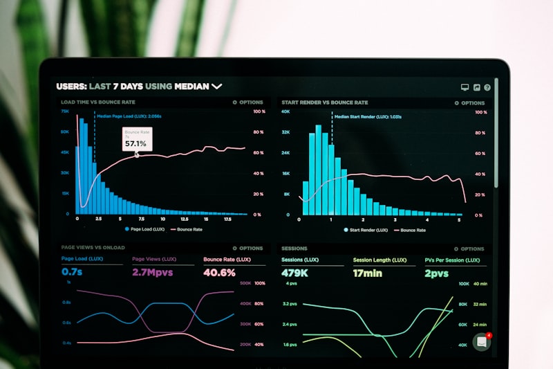
By now you have imported data into Power BI, cleaned it in Power Query, and built your first data model with relationships. The data is ready. The model is solid. Now comes the part that most people see: the visuals. A Power BI report without visuals is just a spreadsheet with extra steps. The visuals are how you turn rows and columns into insight, how you make a busy executive understand a trend in three seconds instead of three minutes. This lesson covers every core visual type you will use in real work: bar charts, column charts, line charts, KPI cards, tables, matrices, pie charts, doughnut charts, slicers for interactivity, and maps for geographic data. It also covers the formatting details that separate amateur reports from professional ones: colors, fonts, borders, titles, and page layout. By the end of this lesson, you will be able to build a report that looks like it came from a consulting firm, not a weekend project.
1. Bar Chart, Column Chart, and Line Chart
These three chart types are the backbone of almost every business report. They answer the most common analytical questions: how do categories compare, how do values change over time, and what is the ranking of items by size. Choosing the right chart type for your data story is the first decision that determines whether your report is clear or confusing.
Column chart: comparing categories vertically. The clustered column chart is the default choice for comparing values across categories. Categories sit on the horizontal axis, values on the vertical axis. The human eye judges vertical height more accurately than horizontal length, which makes column charts slightly more precise than bar charts for most comparisons. To create one, click the Clustered column chart icon in the Visualizations pane. Drag a categorical field, like Product Category or Region, into the X-axis well. Drag a numeric measure, like Total Revenue or Order Count, into the Y-axis well. Power BI automatically aggregates the numeric field, usually by Sum. If you want Average or Count instead, click the field in the Y-axis well and change the aggregation from the dropdown.
Bar chart: comparing categories horizontally. The clustered bar chart flips the axes. Categories sit on the vertical axis, values on the horizontal axis. Use a bar chart when your category labels are long, for example full product names or customer names, because horizontal text is easier to read than vertical or diagonal text. Bar charts are also better when you have many categories, because the vertical axis can scroll while the horizontal axis in a column chart becomes crowded. To create one, click the Clustered bar chart icon and populate the Y-axis with your categorical field and the X-axis with your numeric measure.
Line chart: showing trends over time. The line chart is the correct choice for continuous data, especially dates. It connects data points with a line, which emphasizes the direction and rate of change rather than the absolute value at each point. To create one, drag a date field into the X-axis well and a numeric measure into the Y-axis well. Power BI automatically creates a date hierarchy: Year, Quarter, Month, Day. You can drill down by clicking the expand arrows on the chart or by selecting a specific level from the field well. If you have multiple measures to compare, for example Actual Revenue versus Target Revenue, drag both into the Y-axis well. Power BI draws two lines with different colors and adds a legend automatically.
Formatting chart basics. With any chart selected, the Format visual pane opens on the right. Under X-axis and Y-axis, you can set the title, font size, and color. Turn off the axis title if the field name is self-explanatory, because redundant titles waste space. Under Data colors, you can change the default color for each series. Choose a single corporate color for one-series charts, or a carefully chosen palette for multi-series charts. Avoid the default rainbow colors. They look unprofessional and make it harder to associate colors with meaning. Under Title, give your chart a descriptive but concise title. "Revenue by Region" is better than "Chart 1" or the default field name. Turn the title on, set the font to Segoe UI or Arial at 14pt, and use a dark gray like #333333 instead of pure black, which is softer on the eyes.
Data labels and tooltips. Under Data labels, turn labels on if the chart has few bars or lines, so exact values are visible without hovering. For charts with many categories, labels create clutter, so leave them off and rely on tooltips. The tooltip appears when you hover over a data point. You can customize the tooltip by creating a separate report page with the Tooltip page size, adding visuals to it, and setting it as the tooltip page for your main chart in the Format pane under Tooltip. This is an advanced technique that makes your report feel like a polished application.

2. Card Visual for KPI Metrics
A card visual displays a single number, large and prominent. It is the fastest way to communicate a headline metric. When an executive opens your report, the first thing they should see is the number that matters most: total revenue, total customers, average order value, or conversion rate. The card visual exists for this purpose.
Creating a card visual. Click the Card icon in the Visualizations pane. Drag a numeric field or measure into the Fields well. The card displays the value in a large font, with the field name as a smaller label beneath it. If you drag a categorical field into a card, Power BI counts the distinct values by default, which can be useful for a "Total Products" or "Unique Customers" card.
Formatting for impact. In the Format pane, under Callout value, increase the font size to 28pt or 36pt for a dashboard header. Change the color to your primary brand color or a dark gray. Under Category label, set the font to 12pt in a lighter gray, and consider changing the label text to something more descriptive than the raw field name. If your measure is named "Sum of Revenue," change the label to "Total Revenue" or "Revenue (NGN)." Under Background, add a subtle fill color like #F8F9FA with a slight border. This creates the card effect you learned in the Excel dashboard lesson, but in Power BI it is built in.
Multi-row cards for grouped KPIs. If you have several related metrics, for example Revenue, Profit, and Margin, use the Multi-row card visual instead of three separate cards. Drag all three measures into the Fields well. The multi-row card lists them vertically with values and labels. This saves canvas space and groups related metrics visually. Format each row's colors independently if you want to highlight one metric in green and another in red.
Conditional formatting for KPI states. A static number is informative. A number that changes color based on performance is actionable. In the Format pane, under Callout value, click the fx button next to Color. Choose Conditional formatting and set rules: if the value is greater than 10,000,000, make it green; if less than 5,000,000, make it red; otherwise, make it amber. This is called a traffic light system and is standard in executive dashboards. The color changes dynamically as the underlying data refreshes or as slicers filter the data.
3. Table and Matrix Visual
Sometimes a chart abstracts too much. Your audience needs to see the exact numbers, read them, compare them cell by cell, or export them to Excel. Tables and matrices are the visuals for this. They are not flashy, but they are indispensable for detailed reporting.
Table visual: flat rows and columns. Click the Table icon in the Visualizations pane. Drag fields into the Values well in the order you want them to appear. The table displays one row per record, or one row per unique combination if you include categorical fields. Unlike Excel, Power BI tables do not show gridlines by default, which is cleaner, but you can add them under Grid in the Format pane if your audience expects them. Format the header row with a bold font and a background color like #0a6e6e with white text for a professional look. Set the font size to 11pt for data rows and 12pt for headers. Enable Text wrap if any column contains long text, so rows expand vertically instead of truncating.
Matrix visual: pivot-style with drill-down. The matrix is Power BI's version of a Pivot Table. It supports row hierarchies, column hierarchies, and subtotals. Drag a categorical field into Rows, another into Columns, and a numeric measure into Values. Power BI creates a cross-tabulation. If you drag a date hierarchy into Rows, you get Year, then Quarter, then Month, with expand and collapse arrows at each level. This is powerful for time-based analysis. Under Row headers and Column headers in the Format pane, you can set indentation, font size, and plus/minus icon styles for the drill-down controls.
Conditional formatting in tables and matrices. Select a numeric column in your table or matrix. In the Format pane, under Cell elements or Conditional formatting, choose Background color or Font color. Set rules or gradients. For example, apply a green-to-red gradient on a Profit Margin column so high margins are green and negative margins are red. This turns a dense table into a heat map that guides the eye to problems instantly. You can also add Data bars, which are small horizontal bars inside each cell proportional to the value, similar to Excel's conditional formatting data bars. Use them sparingly. One or two key columns per table is enough. If every cell has a data bar, the visual noise overwhelms the data.
Sorting and totaling. Click any column header in a table or matrix to sort ascending or descending. Click again to reverse. To add totals, enable Total under Values in the Format pane. For matrices, you can enable row totals, column totals, or both. Totals should always be visually distinct: bold font, top and bottom borders, or a slightly darker background. This separates the summary from the detail.

4. Pie Chart and Doughnut Chart
Pie charts and doughnut charts show part-to-whole relationships. They are among the most misused chart types in business reporting because they are easy to create but hard to read accurately. The human eye is bad at comparing angles and areas. A pie chart with ten slices is nearly impossible to interpret. Use these charts only when you have a small number of categories, ideally two to five, and when the emphasis is on the proportion of the total rather than the exact values.
Creating a doughnut chart. The doughnut chart is generally preferred over the pie chart in modern reporting because the hole in the center can display a total or a key metric, making it more informative. Click the Doughnut chart icon. Drag a categorical field into Legend and a numeric measure into Values. Power BI calculates the percentage of each slice automatically. The legend appears by default, but for a cleaner look, you can turn it off and use Data labels with category names and percentages displayed directly on the slices.
When to use them. Use a doughnut chart for market share, budget allocation, or payment method distribution. Do not use it for trends over time, for that, use a line chart. Do not use it for ranking items by size, for that, use a bar chart. Do not use it when slices are similar in size, because viewers cannot distinguish them. If your data produces slices that are all between 15 percent and 25 percent, a table or a bar chart communicates the differences more clearly.
Formatting for clarity. In the Format pane, under Data colors, assign distinct, meaningful colors. If one slice represents a problem category, like Returns or Cancellations, make it red. If another represents a target category, make it green. Under Detail labels, display both the category name and the percentage. Turn on Labels overflow if slice labels are long, so they wrap instead of being cut off. For the doughnut center, you cannot add a native label directly, but you can overlay a card visual in the center of the doughnut, sized and positioned to display the total. Group the two visuals together so they move as one unit.
Avoiding the pie chart trap. If you find yourself creating a pie chart with more than five slices, stop. Either group the smallest slices into an Other category, or switch to a bar chart. The Other category is created by adding a new measure that groups all items below a threshold. This is cleaner and more honest than squeezing twelve tiny slices into a circle where none of them are readable.
5. Slicer Visual: Interactive Filters
A slicer is a visual filter. It sits on your report page and lets users click values to filter every other visual on the page instantly. It is the primary mechanism for interactivity in Power BI. Without slicers, your report is a static image. With slicers, it becomes an analytical tool that lets users explore the data themselves.
Creating a slicer. Click the Slicer icon in the Visualizations pane. Drag a categorical field, like Region or Product Category, or a date field, like Order Date, into the Field well. Power BI displays the unique values as a list. Click any value, and every other visual on the page filters to show only data matching that selection. Hold Ctrl and click multiple values to select several at once. Click the eraser icon or the X to clear the selection and restore the full view.
Slicer styles: list, dropdown, and tile. In the Format pane, under Slicer settings, you can change the style. List shows all values vertically, which is good for short lists. Dropdown collapses the list into a single line, saving space for long lists like customer names or product SKUs. Tile displays values as buttons in a grid, which is excellent for date parts like quarters or for binary choices like Yes/No. Tiles are more visually prominent and easier to click on touchscreens.
Date slicers and hierarchies. When you use a date field in a slicer, Power BI offers a Between style that shows a date range slider, an Before style, an After style, and a List style for individual dates. The Between slider is the most common for dashboards because it lets users drag to select any date range. The date hierarchy in a slicer shows Year, Quarter, Month, and Day levels. Users can drill up and down to find the granularity they need.
Formatting slicers to match your report. Under Items in the Format pane, set the font size to 11pt and the color to dark gray. Set the background color of unselected items to white and selected items to your primary brand color with white text. This makes the active selection obvious. Add a subtle border around the slicer, 1px in light gray. Under Title, give the slicer a clear label like "Filter by Region" or "Select Date Range." Position slicers consistently across all pages of your report, usually at the top or on the left, so users always know where to find them.
Syncing slicers across pages. If your report has multiple pages, you can sync a slicer so that a selection on one page filters visuals on all pages. Select the slicer, go to View → Sync slicers, and check the pages you want the slicer to affect. This is powerful for multi-page reports but use it carefully. If every page is filtered by the same region slicer, users may forget they have an active filter and misinterpret a page that appears empty because of it. Always include a visible indicator of active filters, or add a button to reset all slicers.

6. Map Visual: Geographic Data
Maps transform location data into spatial insight. They answer questions that tables and charts cannot: where are my customers concentrated, which regions are underperforming, and where should I open the next store? Power BI has two built-in map visuals: the basic Map and the more advanced Filled map. For this bootcamp, the basic Map is sufficient.
Creating a map visual. Click the Map icon. Drag a geographic field into the Location well. This can be a country name, a state, a city, or latitude and longitude coordinates. Power BI attempts to geocode the locations automatically using Bing Maps. If your field is recognized as geographic, a globe icon appears next to it in the Fields pane. If not, you can manually set the data category by selecting the field in the Data pane, going to the Column tools tab, and choosing Data category → Country, State, City, or Postal Code.
Adding a size measure. Drag a numeric measure into the Size well. Power BI represents each location with a bubble whose area is proportional to the measure value. Larger bubbles mean higher values. For example, if Location is State and Size is Total Revenue, Lagos appears as a large bubble and smaller states appear as smaller bubbles. You can also drag a measure into the Color saturation well to vary the bubble color by a second metric, like Profit Margin, creating a bivariate map where size shows volume and color shows performance.
Handling geocoding errors. Power BI's geocoding is not perfect. If a location is not recognized, the bubble does not appear, and a warning icon shows in the top-right of the visual. Common causes are misspelled place names, ambiguous names like "Springfield" which exists in multiple countries, or unofficial names. The fix is to use official names, add a Country column to disambiguate, or use latitude and longitude coordinates directly. Latitude and longitude are the most reliable because they bypass geocoding entirely. Create separate columns for latitude and longitude in your data, set their data categories to Latitude and Longitude, and drag them into the respective wells in the map visual.
Map formatting. In the Format pane, under Map controls, you can enable or disable zoom buttons, a search box, and a lasso select tool. For a dashboard, disable these to prevent users from accidentally panning away from your area of interest. Under Bubbles, set the minimum and maximum bubble sizes so small values are still visible and large values do not dominate the map. Under Data colors, choose a single color for bubbles or a gradient for color saturation. Avoid red and green together if your audience includes color-blind viewers; use blue and orange instead, which are distinguishable by most color vision deficiencies.
Map alternatives for static reports. If your data is not geographic, or if the map geocoding fails repeatedly, consider a treemap or a bar chart sorted by region instead. A sorted bar chart often communicates rankings more clearly than a map, because the eye compares bar lengths more accurately than bubble sizes on a map. Use maps when the spatial relationship itself is the insight, not just when your data happens to have a location field.
7. Formatting Visuals: Colors, Fonts, Borders, and Titles
A report with default Power BI formatting looks like a prototype. A report with deliberate, consistent formatting looks like a finished product. The difference is in the details: the color palette, the font choices, the border weights, and the title wording. These details take time, but they are what separate professional analysts from casual users.
Building a color palette. Choose a primary color, a secondary color, and an accent color before you create any visuals. The primary color is for your main data series and KPI highlights. The secondary color is for comparison series, backgrounds, and neutral elements. The accent color is for alerts, selections, and calls to action. A safe corporate palette might be: primary #0a6e6e, a deep teal; secondary #6c757d, a medium gray; accent #c98a3e, a warm amber. Apply these consistently. Do not let Power BI assign random colors to each chart. In the Format pane, under Data colors, manually assign your palette to each series. For conditional formatting, use green for positive, red for negative, and amber for warning, but ensure the green and red are distinguishable to color-blind users by also varying brightness or adding icons.
Font consistency. Use one font family for the entire report. Segoe UI is the Power BI default and is clean and modern. Arial is a safe alternative. Do not mix serif and sans-serif fonts on the same page. Set titles to 14pt or 16pt bold. Set axis labels and data labels to 10pt or 11pt. Set slicer items and table text to 11pt. Any text smaller than 10pt is hard to read on a projector or a small laptop screen. Any text larger than 18pt wastes space unless it is a headline KPI.
Borders and backgrounds. For KPI cards and grouped visuals, add a 1px border in #E0E0E0, a light gray. This separates elements without creating heavy visual lines. For the page background, use white or a very light gray like #FAFAFA. Dark backgrounds are trendy but harder to read and problematic for printing. If you use a dark background, ensure all text is light enough to meet WCAG contrast standards. For individual visuals, add a subtle background fill only if they are grouped inside a larger section. Too many background colors create a patchwork effect.
Title discipline. Every visual should have a title, and every title should answer a question. "Revenue by Region" is better than "Chart." "Q1 2026 Revenue vs. Target" is better than "Line chart 2." Turn off titles only for decorative elements like background shapes. Position titles at the top-left of each visual, aligned with the visual's left edge. If a visual is self-explanatory because of slicer context, you can shorten the title, but never omit it entirely. In the Format pane, under Title, set the font to bold, 14pt, and your primary dark color. Add a bottom border to the title if you want extra separation, 1px in your primary color.
Alignment and spacing. Select multiple visuals by holding Ctrl and clicking each one. In the Format pane, under Align, use Distribute horizontally, Distribute vertically, Align left, and Align top to create perfect grids. Leave at least 16 pixels between visuals. Crowded reports feel chaotic. Use the Selection pane under View to name and layer your visuals. Name them descriptively: "KPI Revenue Card," "Region Bar Chart," "Date Slicer." This makes maintenance easier when you return to the report months later.
8. Page Layout, Canvas Size, and Background
The page is the container for all your visuals. Its size, orientation, and background set the tone for the entire report. A page that is too small forces you to cram visuals together. A page that is too large leaves empty space that looks unfinished. The background sets the visual hierarchy: what is the report, and what is just the page behind it?
Canvas size and orientation. Go to View → Page settings or select the page and open the Format pane. The default canvas size is 16:9, 1280 by 720 pixels, which is optimized for modern screens and projectors. If your report will primarily be viewed on wide monitors, use 16:9. If it will be printed or viewed on older 4:3 projectors, change to 4:3, 1024 by 768 pixels. For a scrolling dashboard with many visuals, increase the height while keeping the width at 1280. This creates a vertical scroll. Avoid horizontal scrolling; users hate it. The Custom option lets you set exact pixel dimensions if you need to match a specific display or embed the report in an iframe.
Page background. In the Format pane, under Page background, set the color to white or a very light gray. Add a background image only if your organization requires branded headers or watermarks. If you do use a background image, keep it subtle, low opacity, and ensure it does not interfere with text readability. A common technique is to create a background image in PowerPoint or Photoshop with a header bar, footer bar, and section dividers, then import it as the page background and place visuals inside the designated areas. This gives a polished, template-driven look.
Page alignment and snap settings. Under View → Snap to grid and Snap to objects, enable both. Snap to grid aligns visuals to an invisible grid, making manual placement more precise. Snap to objects aligns visuals to each other, so when you drag a chart near another chart, it snaps to the same left edge or top edge. These settings are essential for fast, clean layout without constant use of the Align tools.
Page navigation and buttons. For multi-page reports, add navigation buttons so users can move between pages without using the bottom tab bar. Insert a Button from the Insert menu, choose Blank, and format it as a rectangle with text like "Next Page" or "Drill to Details." Under Action, set the type to Page navigation and select the target page. Position navigation buttons consistently, usually at the top-right or bottom-right of every page. This makes the report feel like an application rather than a collection of slides.
Mobile layout. Power BI reports can be viewed on phones and tablets. Go to View → Mobile layout to design a separate, simplified version of each page for mobile devices. The mobile layout uses a vertical phone canvas. You drag visuals from the main page into the mobile canvas and arrange them vertically. Not every visual needs to appear on mobile. Focus on the top three KPIs and one or two key charts. Hide detailed tables and complex matrices. The mobile layout is increasingly important as executives check dashboards on their phones between meetings.

Quick recap: Column charts compare categories vertically, bar charts compare horizontally for long labels, line charts show trends over time · Card visuals display single headline metrics with large fonts and conditional color formatting · Tables show flat rows, matrices support pivot-style hierarchies with drill-down · Doughnut charts show part-to-whole for small category counts, avoid pie charts with many slices · Slicers enable interactive filtering, use list, dropdown, or tile styles, and sync across pages · Map visuals geocode locations into bubbles, use latitude and longitude for reliability · Format with a three-color palette, consistent fonts, subtle borders, and descriptive titles · Set canvas size to 16:9 for screens, use snap settings for alignment, and design mobile layouts for phone viewing.
Using AI to Move Faster in Power BI Visual Design
Power BI's visual formatting options are extensive, and the temptation is to tweak every setting manually. AI can help you make faster, better design decisions by suggesting optimal chart types, generating color palettes, and even building custom visuals from descriptions. Here is how to apply it.
1. Use Copilot to choose the right visual for your data story.
If you are unsure whether a trend is better shown as a line chart or an area chart, or whether a ranking is clearer as a bar chart or a treemap, describe your data and your goal to Copilot: "I have monthly revenue and target data for six regions. I want to show whether each region is above or below target. Should I use a clustered column chart, a line chart, or something else? Give me the Power BI steps." AI will recommend the best visual type, explain why, and list the exact fields to drag into each well. This prevents the common mistake of defaulting to whatever visual you created last.
2. Generate professional color palettes with AI.
A cohesive color scheme is hard to invent on the spot. Ask an AI assistant: "Generate a professional three-color palette for a financial dashboard in Power BI, with hex codes, suitable for color-blind viewers, where one color means positive, one means negative, and one is neutral." You will get a palette like #2E7D32 for positive, #C62828 for negative, and #455A64 for neutral, all tested for color-blind accessibility. Copy the hex codes into Power BI's Data colors settings. This is faster and more reliable than guessing colors by eye.
3. Let AI write DAX measures for complex KPIs.
The card visual is only as good as the measure behind it. If you need a year-over-year growth percentage, a rolling twelve-month average, or a target attainment ratio, describe the calculation in plain language: "Write a DAX measure that calculates the percentage change in revenue compared to the same month last year, and returns BLANK if there is no prior year data." AI will generate the DAX formula, usually using CALCULATE, SAMEPERIODLASTYEAR, and DIVIDE. Copy it into Power BI's formula bar, name it appropriately, and assign it to a card visual. Always verify the result against a manual calculation for one or two months before trusting it across the entire dataset.
4. Use AI to critique your report layout.
After building your first draft, take a screenshot and ask an AI vision model: "Critique this Power BI report for visual hierarchy, color consistency, and readability. What should I remove, resize, or reposition?" AI can spot alignment issues, overcrowded areas, charts that are too small to read, and color clashes that you have become blind to after hours of work. Apply the suggestions that improve clarity, and ignore the ones that conflict with your specific business requirements.
5. Verify AI-generated DAX before deploying to production.
DAX is a powerful language, and AI-generated measures can contain subtle errors: incorrect filter context, missing BLANK handling, or division by zero. Always test AI-generated DAX with edge cases. What happens when the denominator is zero? What happens when there is no data for the selected filter? What happens when a user selects multiple values in a slicer that the measure assumes is single-select? Build a test matrix with a table visual showing the measure under different filter combinations, and confirm the results match your expectations before adding the measure to your dashboard.
A habit worth building from this lesson onward: before adding any visual to your report, ask yourself what question it answers. If you cannot state it in one sentence, remove the visual. Then ask AI whether a different visual type would answer that question more clearly. The combination of your business judgment and AI's design knowledge produces reports that are both accurate and beautiful. Beauty is not vanity in data visualization. It is the difference between a report that is glanced at and one that is understood.
Next lesson: DAX fundamentals, calculated columns, and measures.