Webbo3 Data Analysis Bootcamp · Excel Module · Lesson 6
Excel Dashboard Design: Layout Principles, Visual Elements, Interactivity, and Professional Presentation
A hands-on lesson covering how to plan a dashboard layout, build it with shapes and linked objects, add interactive controls, and present a polished final sheet that looks nothing like a raw spreadsheet.
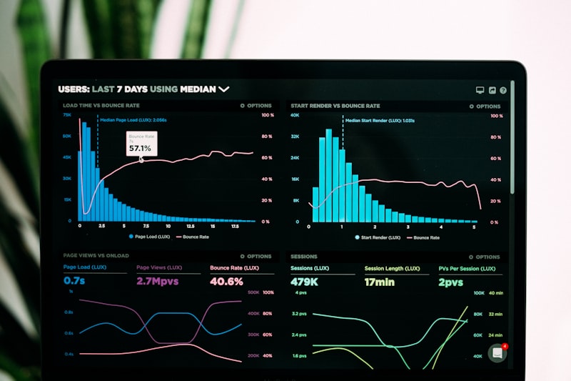
By this point in the bootcamp you have learned to clean data, build Pivot Tables, and create charts. Those are the ingredients. A dashboard is the finished meal. It is a single sheet where a manager or client can glance at one screen and understand a story that would otherwise take fifteen minutes of clicking through tabs to piece together. The difference between a raw data sheet and a dashboard is not the data itself. It is the deliberate design: the layout, the visual hierarchy, the interactivity, and the removal of every unnecessary pixel that does not serve that story. This lesson teaches you to build that.
1. Dashboard Layout Principles
Before you insert a single chart, you must decide what this dashboard is supposed to answer. A dashboard without a clear question becomes a messy collage instead of a decision-making tool. Start by writing down the three most important questions your audience needs answered. For example: Which region has the highest returns this quarter? Is our revenue trend improving month over month? Which product category is dragging profit down? Every visual element you add must answer one of those questions directly. If it does not, remove it.
The inverted pyramid layout. Place the most critical metric, the headline number, at the top left of your dashboard. This is where the eye lands first. Below it, place summary charts that show trends over time. At the bottom or to the right, place detailed breakdowns and tables that support the summaries above. This mirrors how people read: top to bottom, left to right, general to specific. Do not bury your most important chart in the middle of the sheet.
The rule of thirds and white space. Divide your dashboard mentally into a three-by-three grid. Align your key elements to those gridlines rather than scattering them randomly. Leave deliberate gaps between elements. White space is not wasted space. It is the margin that lets each chart breathe and prevents the viewer from feeling overwhelmed. If every cell is filled, nothing stands out.
Consistent sizing and alignment. Charts of the same type should have identical dimensions. If your four KPI cards are 200 pixels wide, make all four exactly 200 pixels wide. Use Excel's alignment tools: select multiple objects, go to Shape Format → Align, and choose Align Top, Align Left, or Distribute Horizontally. Small misalignments are invisible individually, but together they make a dashboard look amateur.
Color discipline. Choose a palette of three colors maximum: one primary color for your main data series, one neutral gray for secondary elements, and one accent color for highlights or alerts. Do not let Excel's default rainbow palette decide for you. To change chart colors, click the chart, then Chart Design → Change Colors, or manually select each data series and use the Fill paint bucket. For a professional look, use subtle tones: deep navy, soft teal, or charcoal, not bright red and green unless you are specifically showing negative versus positive variance.

2. Using Shapes, Text Boxes, and Icons
Excel is not a design tool like Figma or Illustrator, but it has enough drawing capability to build a clean, modern interface if you use its shapes deliberately. The goal is to make the dashboard feel like an application, not a spreadsheet.
Shapes as containers. Go to Insert → Shapes and choose a rectangle with rounded corners. Draw it behind your KPI numbers to create a card effect. Right-click the shape, choose Format Shape, set Fill to a very light gray like #F8F9FA, set the border to a thin solid line in a slightly darker gray, and remove any shadow effects. Shadows in Excel tend to look dated and blurry. A flat, clean card looks far more professional. Place these shapes on your sheet first, then layer your text boxes and numbers on top of them.
Text boxes for labels and titles. Do not type dashboard titles directly into cells. Cell-based titles are constrained by row heights, column widths, and gridlines. Instead, use Insert → Text Box. Draw it above your chart or card, type your title, and format it with a clean sans-serif font like Arial or Calibri, bold, at 14pt or 16pt. For explanatory subtitles, use the same font at 11pt in a lighter gray. This separates your presentation layer from your data layer completely.
Icons for quick visual scanning. Excel 365 and Excel 2021 include a built-in icon library at Insert → Icons. Search for relevant terms like "trend," "money," "users," or "calendar." Insert an icon, resize it to sit beside your KPI number, and change its color to match your dashboard palette. A small upward arrow beside a revenue figure lets the viewer absorb the direction of change before they even read the number. Do not overuse icons. One per KPI card is enough. If everything has an icon, nothing has meaning.
Layering and grouping. When you have a card shape, a text box title, a number, and an icon all forming one KPI unit, select all four objects while holding Ctrl, then right-click and choose Group. This locks them together so you can move or resize the entire unit as one object. It also prevents accidental misalignment later when you adjust the sheet. To select objects that are layered behind others, go to Home → Find & Select → Selection Pane. This opens a list of every object on your sheet, and you can click names to select hidden or buried items easily.
3. Linking Charts and Pivot Tables to a Dashboard Sheet
A dashboard sheet should contain almost no raw data. Its job is to display and summarise what lives elsewhere. Your data belongs in a dedicated data sheet or table. Your Pivot Tables belong in an analysis sheet. Your dashboard sheet pulls from those sources.
Creating the dashboard sheet. Right-click any sheet tab at the bottom, choose Insert → Worksheet, and rename it to "Dashboard." This sheet will hold only your presentation objects: shapes, text boxes, charts, and form controls. Keep your raw data on a sheet named "Data" and your Pivot Tables on a sheet named "Analysis." This three-layer structure, Data → Analysis → Dashboard, is the professional standard because it separates storage, computation, and presentation.
Linking charts to the dashboard. Build your chart on the Analysis sheet first, based on a Pivot Table or summary formulas. Once the chart looks correct, click to select it, press Ctrl + X to cut it, click the Dashboard sheet tab, and press Ctrl + V to paste it. The chart remains linked to its original data source on the Analysis sheet, but it now lives on the Dashboard sheet. When the underlying data changes, the chart updates automatically. If you need multiple charts, repeat this process. Arrange them on the Dashboard using the alignment tools discussed earlier.
Linking individual cells for KPI numbers. Sometimes you do not need an entire chart. You just need one number, like total revenue, pulled from a Pivot Table. On the Dashboard sheet, click into a text box or a cell, type =, then click the Analysis sheet tab, click the cell that holds your total revenue, and press Enter. The Dashboard now displays that value dynamically. If the Pivot Table refreshes and the total changes, the Dashboard updates instantly. Format this linked cell inside a shape card for a polished look.
Refreshing Pivot Table connections. If your dashboard looks stale after updating raw data, the Pivot Tables may not have refreshed. Right-click any Pivot Table, choose Refresh, or go to PivotTable Analyze → Refresh All. You can also set Pivot Tables to refresh automatically when the workbook opens: right-click the Pivot Table, choose PivotTable Options → Data, and check Refresh data when opening the file. This ensures your dashboard is never showing yesterday's numbers by accident.

4. Form Controls: Dropdown Lists, Checkboxes, and Scroll Bars
Static dashboards tell a story once. Interactive dashboards let the user ask their own follow-up questions. Form controls are the native Excel tools that make this possible without writing a single line of VBA code. They live on the Developer tab. If you do not see the Developer tab, enable it via File → Options → Customize Ribbon, then check the Developer box on the right.
Dropdown lists with Combo Boxes. On the Developer tab, click Insert → Combo Box (Form Control) and draw it on your Dashboard sheet. Right-click it, choose Format Control, and set the Input range to the list of items you want displayed, for example a vertical list of region names on your Analysis sheet. Set the Cell link to an empty cell on the Analysis sheet, for example Z1. Now when a user picks "Lagos" from the dropdown, cell Z1 shows 1. If they pick "Abuja," Z1 shows 2. You can then use the INDEX or CHOOSE function in your analysis formulas to return the actual region name based on that number, and your charts will filter accordingly. This is how you let a user switch the entire dashboard view by region without touching the raw data.
Checkboxes for on-off toggles. Insert a Checkbox from the same Form Controls menu. Right-click it, choose Format Control, and link it to a cell. When the checkbox is checked, the linked cell shows TRUE. When unchecked, it shows FALSE. You can then use an IF formula that says: if this cell is TRUE, include this branch's numbers in the total; if FALSE, exclude them. This is powerful for letting users compare scenarios, for example showing revenue with returns included versus without returns included, on the same chart.
Scroll bars for time periods. A Scroll Bar form control lets users drag a slider to move through a range of values, for example months or years. Insert it, right-click to format, set the minimum to 1, maximum to 12, and link it to a cell. Use that cell inside an OFFSET or INDEX formula to pull the corresponding month from your data table into a summary range that feeds your chart. A user can now slide through the year and watch the chart animate month by month. Keep the step size at 1 for months, and set a page change of 3 if you want arrow clicks to jump a quarter at a time.
Styling form controls. Form controls in Excel are functional but visually plain. You cannot change their internal colors easily. The trick is to layer them. Place your dropdown or checkbox on top of a clean rectangle shape that matches your card design, so the control looks like it belongs to the interface rather than floating randomly. Resize the control to fit neatly inside the shape boundaries. Group the control and its background shape together once positioned.
5. Camera Tool for Dynamic Snapshots
The Camera tool is one of Excel's most underused features, and it solves a specific dashboard problem: how do you show a live picture of a range of cells, including their formatting, without actually placing those cells on the dashboard sheet? The answer is a linked picture.
Adding the Camera tool to your Quick Access Toolbar. The Camera tool is hidden by default. Click the small dropdown arrow at the very top of Excel on the Quick Access Toolbar, choose More Commands, change the dropdown from Popular Commands to All Commands, scroll down to find Camera, select it, and click Add. You now have a camera icon permanently available at the top of Excel.
Using the Camera tool. Select any range of cells on your Analysis sheet, for example a neatly formatted summary table with conditional formatting colors. Click the Camera icon. Then click on your Dashboard sheet where you want that snapshot to appear. Excel pastes a live, linked picture of that range. It looks like a picture, but it is actually a window into the original cells. If the numbers in the Analysis sheet change, the picture updates automatically. If the conditional formatting changes the cell colors, the picture reflects those colors too.
Why use this instead of a chart? Sometimes a formatted table communicates better than a chart, especially when the audience needs to read exact values. A Pivot Table with conditional formatting rules, heat map colors, and custom number formats is hard to replicate as a native chart. The Camera tool lets you preserve that exact formatting and display it on the dashboard as a clean image object that you can resize, move, and layer behind shapes.
Resizing and cropping. After placing the camera picture, you can resize it by dragging the corner handles. Hold Shift while dragging to maintain the aspect ratio. If you need to change which range the picture points to, click the picture, then in the Formula Bar you will see a reference like =Analysis!$A$1:$D$10. Edit that reference directly to point to a different range. To break the link and turn it into a static image, right-click, choose Copy, then Paste Special as a picture. Only do this if you are certain the source data will never change.

6. Hiding Gridlines, Headers, and Sheet Tabs for a Clean Look
The final step in dashboard design is removing every trace that this was ever a spreadsheet. You want the viewer to see a professional application, not a grid of cells. Excel gives you precise control over what interface elements remain visible.
Hide gridlines. Go to the View tab and uncheck Gridlines. This removes the gray cell borders across the entire sheet instantly. If you only want to hide gridlines on the Dashboard sheet but keep them visible on your data sheets, select all cells on the Dashboard sheet by clicking the triangle at the intersection of row and column headers, then go to Home → Fill Color → No Fill, and set the background to white. Then go to Page Layout → Sheet Options and uncheck View under Gridlines for this sheet specifically.
Hide row and column headers. Still on the View tab, uncheck Headings. This removes the A, B, C column letters and the 1, 2, 3 row numbers. Without these, the sheet looks like a blank canvas. If you need to navigate while building, you can always turn them back on temporarily. For the final delivery, they stay off.
Hide sheet tabs. If you are delivering this workbook to a client or manager who only needs to see the dashboard, hide the underlying data and analysis sheets so they cannot accidentally break a formula. Right-click the sheet tab you want to hide, choose Hide. To unhide later, right-click any remaining tab and choose Unhide. For even stronger protection, go to Review → Protect Workbook → Protect Structure and set a password. This prevents users from unhiding, deleting, inserting, or renaming sheets without the password. The Dashboard sheet remains fully functional and interactive, but the plumbing behind the wall is locked away.
Freeze panes and full screen. If your dashboard is taller than one screen, use View → Freeze Panes → Freeze Top Row so your header KPIs remain visible while scrolling. For presentation mode, press Ctrl + F1 to collapse the ribbon and give your dashboard the full screen space. Press it again to bring the ribbon back. You can also press Alt + V, U to enter Full Screen view, which hides every Excel element except your sheet itself.
Protect the dashboard sheet. After hiding the structural elements, protect the Dashboard sheet itself so users can click form controls but cannot accidentally drag your charts out of place. Go to Review → Protect Sheet, uncheck Select locked cells if you want to prevent clicking into cells entirely, but leave Edit objects checked if you want form controls to remain usable. Test this thoroughly. A protected dashboard that breaks interactivity is worse than an unprotected one.

Quick recap: Start every dashboard with three clear questions and an inverted pyramid layout · Use shapes as flat cards, text boxes for titles, and icons for quick scanning, then group related objects · Separate Data, Analysis, and Dashboard into three sheet layers · Link charts and KPI cells to the dashboard so they update automatically · Use Combo Boxes, Checkboxes, and Scroll Bars on the Developer tab to let users filter and explore without touching formulas · The Camera tool creates live linked pictures of formatted ranges, preserving conditional formatting perfectly · Hide gridlines, headings, and unnecessary sheet tabs, then protect the workbook structure and sheet to deliver a polished final product.
Using AI to Move Faster in Dashboard Design
Everything in this lesson is a manual craft, and you need to understand the mechanics so you can fix what breaks. But once you know how these pieces fit together, AI can compress hours of formatting and formula work into minutes. Here is exactly how to apply it.
1. Let Copilot generate the analysis layer for you.
Before you build a single chart, select your raw data and ask Copilot: "Summarise this sales data by region and month as a Pivot Table." or "Calculate total revenue, average order value, and return rate from this table." Copilot can write the summary formulas or generate the Pivot Table structure on a new sheet. Your job becomes verifying the logic and then designing the presentation, not wrestling with SUMIFS and COUNTIFS from scratch.
2. Use AI to choose the right chart type.
Not sure whether your time-series data should be a line chart or an area chart? Paste a description of your data into Copilot and ask: "I have monthly revenue and target data for twelve months. Should I use a clustered column chart or a line chart with a target line? Give me the Excel steps." AI can recommend the most readable format and even suggest specific formatting choices, like adding data labels only on the highest and lowest points to reduce clutter.
3. Generate complex interactivity formulas with natural language.
The formulas that power form controls, especially nested IF statements combined with INDEX, MATCH, and OFFSET, are easy to get wrong. Describe what you want in plain language, for example: "Write an Excel formula that returns the sales figure for the region selected in cell Z1 from a table where regions are in column A and sales are in column D." Copilot will likely suggest an INDEX-MATCH or XLOOKUP combination. Copy it, paste it into your Analysis sheet, and link your dropdown to it. This removes the trial-and-error phase of writing interactive formulas.
4. Ask for design feedback before you deliver.
You can export a screenshot of your dashboard and ask an AI vision model: "Critique this Excel dashboard for clarity, color accessibility, and visual hierarchy. What should I remove or rearrange?" AI is surprisingly good at spotting alignment issues, color contrast problems, and cluttered areas because it has been trained on thousands of professional dashboard examples. Treat it like a peer review before your client sees it.
5. Verify every AI-generated formula before it touches your dashboard.
This rule never changes. AI can generate a brilliant interactive formula in seconds, but if it references the wrong column or uses a relative reference where an absolute one is needed, your entire dashboard will show incorrect numbers. Always test AI-generated formulas against a few rows you can calculate by hand before linking them to your presentation layer. Speed is worthless if the insight is wrong.
A habit worth building from this lesson onward: whenever you spend more than ten minutes manually formatting a dashboard element, stop and ask whether Copilot could generate the underlying structure, the formula, or even the formatting steps for you. The design decisions, the layout, and the final polish remain yours. But the repetitive construction work between your idea and your finished dashboard is exactly where AI inside Excel saves the most time.
Next lesson: advanced chart types, sparklines, and trend analysis.